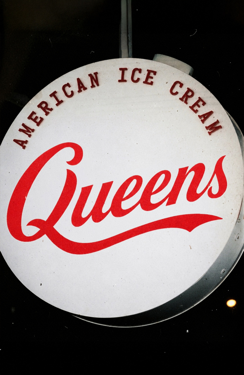
Queens
[Description]
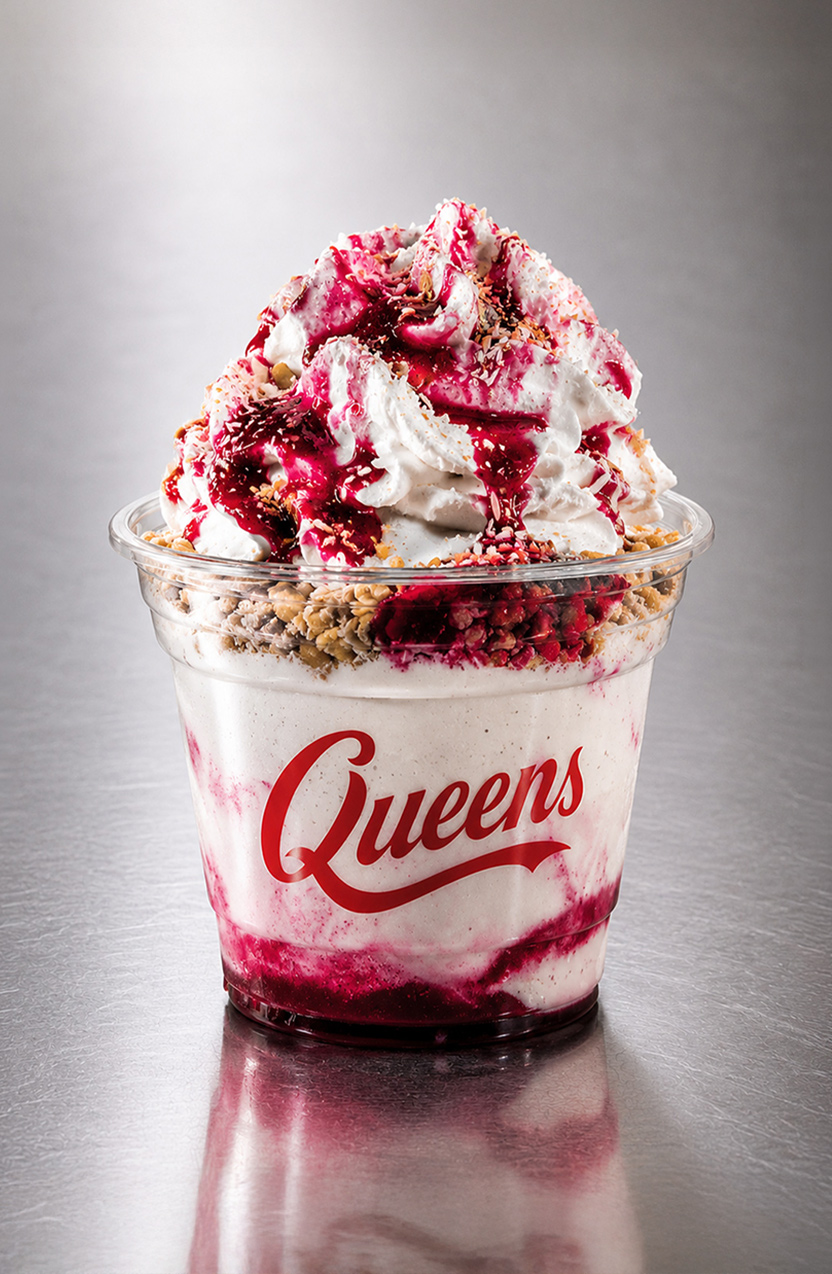
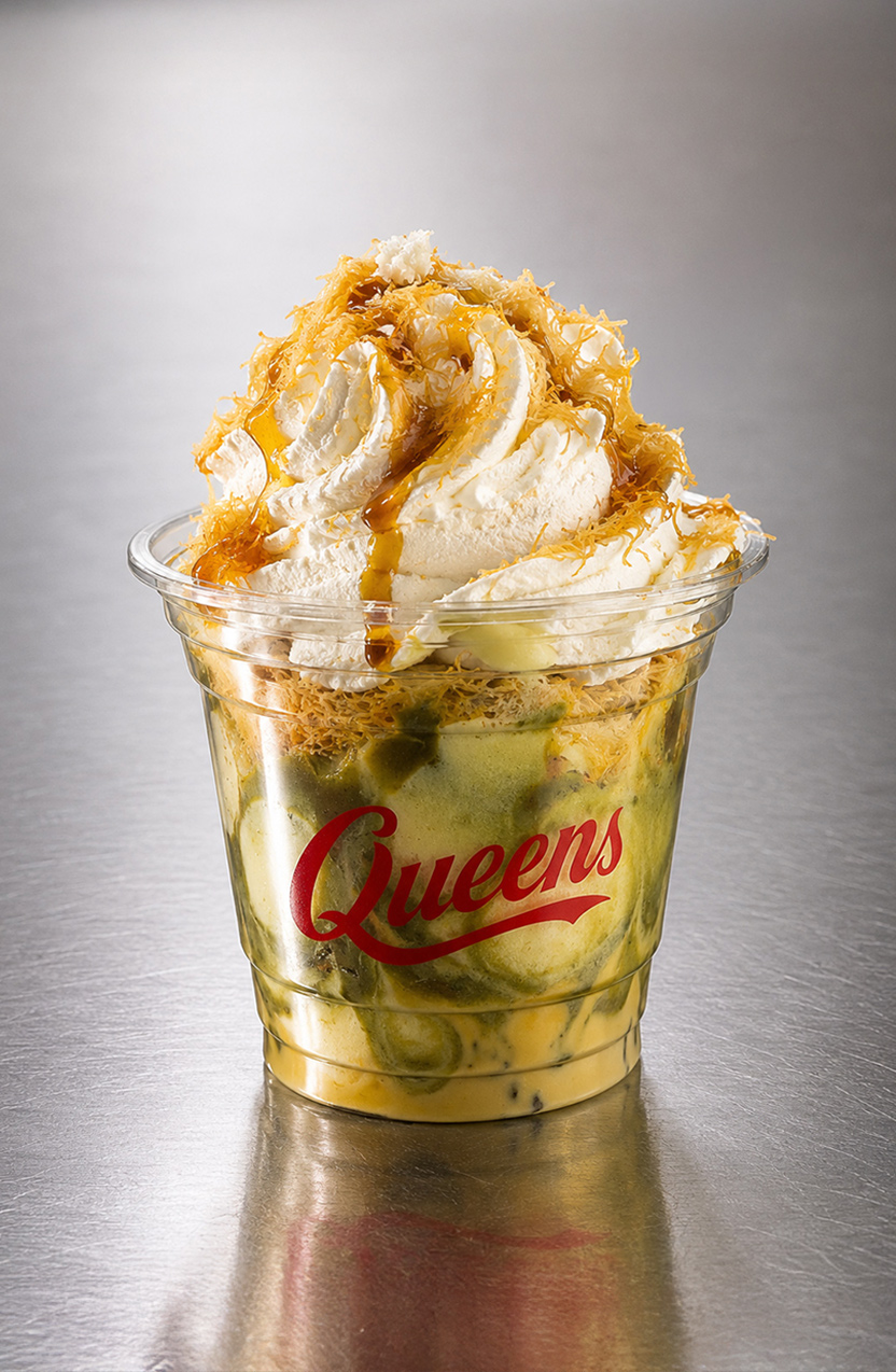
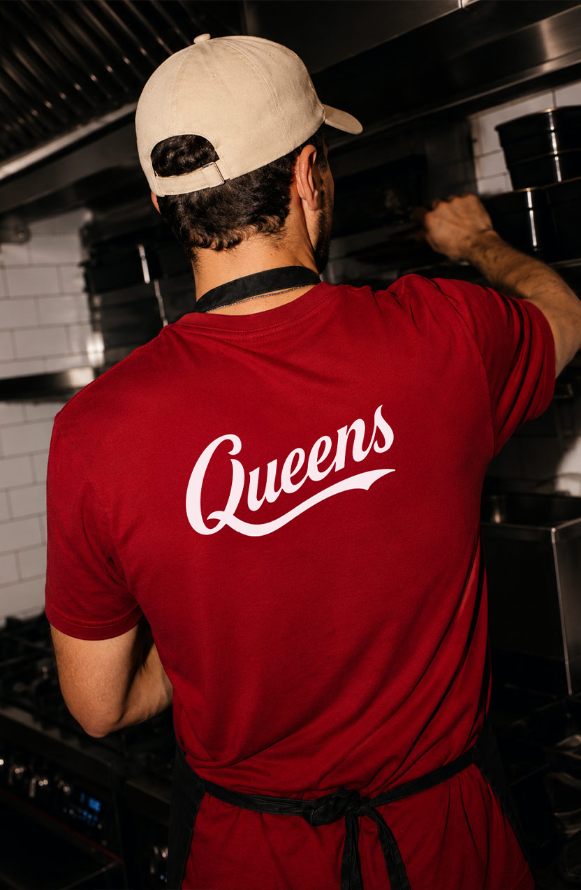
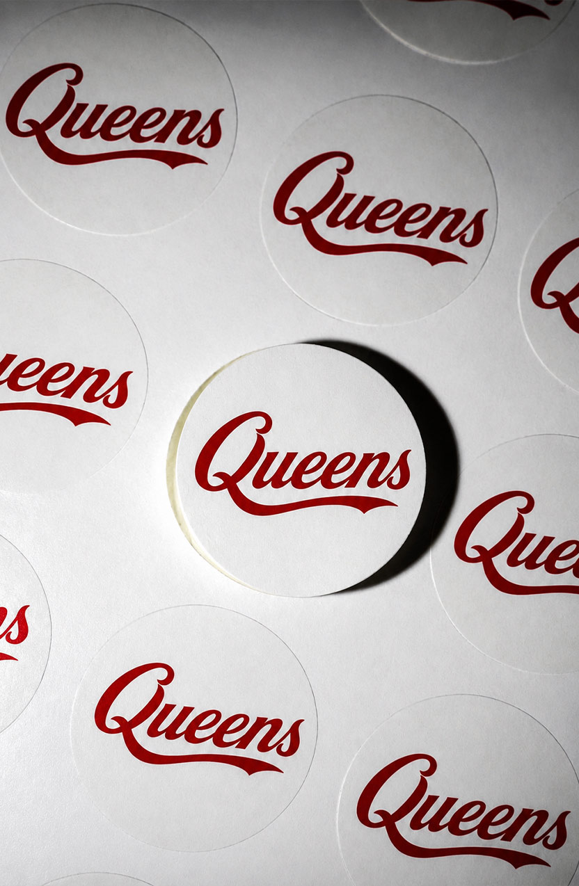
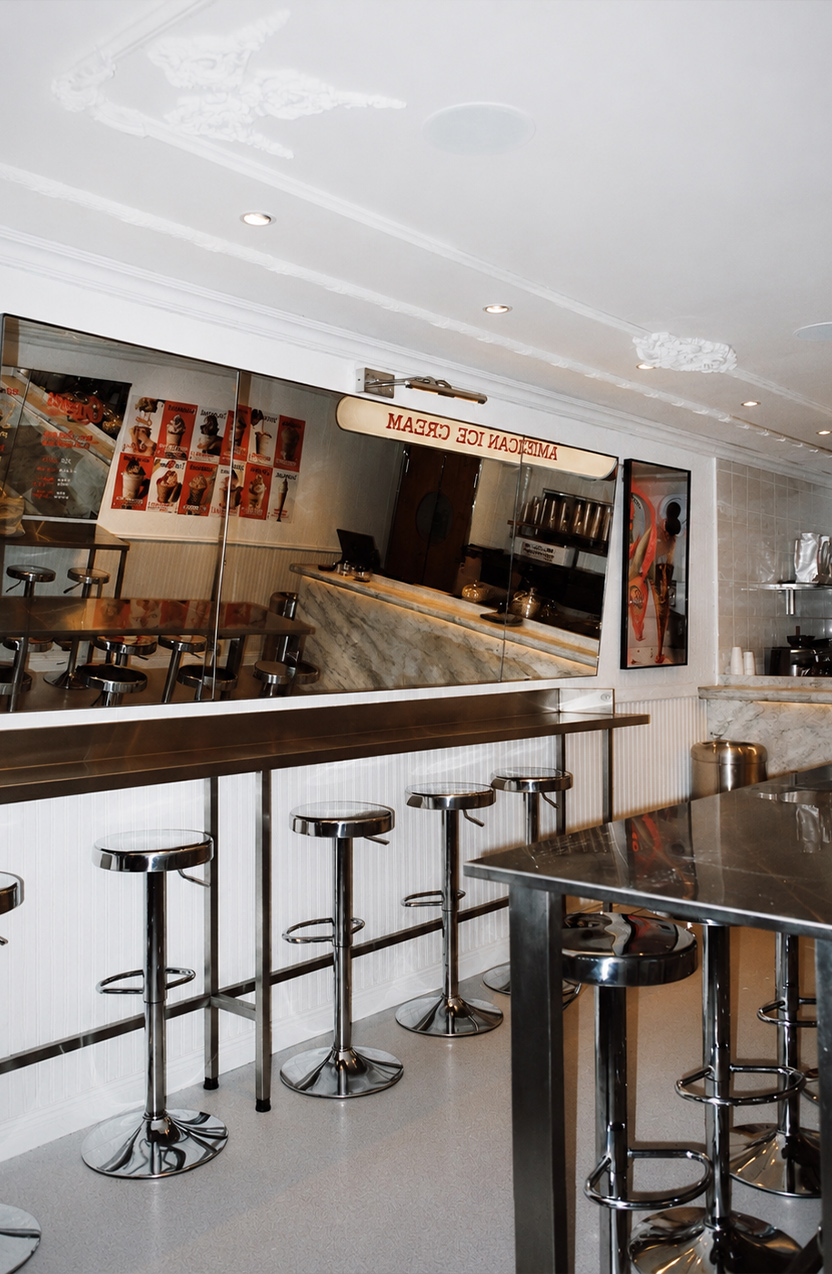
A contemporary American ice cream brand built to feel nostalgic, bold, and impossible to ignore.
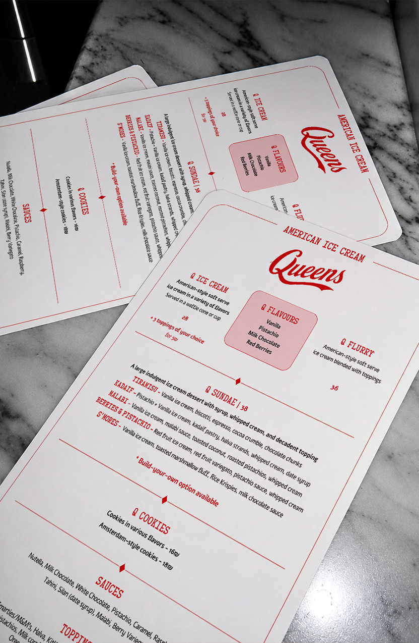
Inspired by vintage Americana, diner culture, and oversized commercial typography, Queens transforms classic dessert branding into a full visual experience designed for maximum memorability.
[The Idea]
Rather than leaning into the soft, playful aesthetics typical of dessert brands, Queens was built around stronger cultural references - borrowing from iconic American food signage, retro indulgence, and bold graphic systems to create a brand with real attitude.
What we did
[Description]
Built a graphic language rooted in resistance – brutalist, stripped-down, and ready to disrupt. Every asset was designed to provoke.
[AI-Generated Visuals]
We created a library of surreal, aggressive, and conceptual imagery using custom AI prompts – abstract human forms, anti-capitalist symbols, and fashion gone rogue.
[Social Media Content]
Designed bold, fast-scrolling posts, stories, and reels – each one built to stop the thumb and punch a message through the noise.
[Digital Packaging]
Visual assets for campaigns, drops, and story takeovers – everything branded with edge and zero compromise.
Not a barcode in sight.
[LET’S build something bold together]
REady to make your vision a reality?
